The Challenge
When someone loses a loved one, the last thing they need is a frustrating claims process
Prudential's individual life insurance (ILI) claims process had a fundamental problem: it put the burden on grieving families at their most vulnerable moment.
Beneficiaries had to go find Prudential after losing a loved one, never the other way around. The process was paper-heavy, slow, and impersonal. Many beneficiaries were so put off by the experience that they never became Prudential customers themselves, a real loss of lifetime value for both sides.
We were brought in to ask a harder question: what if we started over?
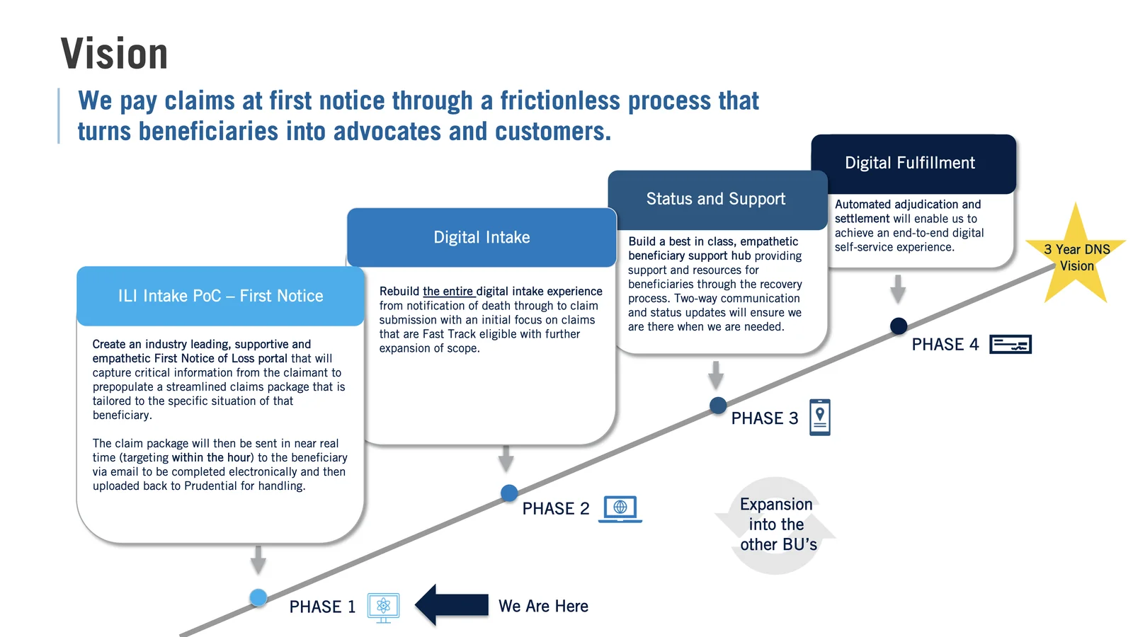
"We pay claims at first notice through a frictionless process that turns beneficiaries into advocates and customers."Project vision statement
The Vision
Reaching families first, before they have to ask
Rather than redesign a form, we rethought the whole relationship. Prudential already had the data to know when a policyholder died, so it could reach the beneficiary first instead of waiting to be found. We wanted that first contact to feel respectful, not transactional.
We laid the roadmap out in four phases, each one building toward a three-year goal: claims handled fully online.
The Process
Two tracks at once, tested as we went
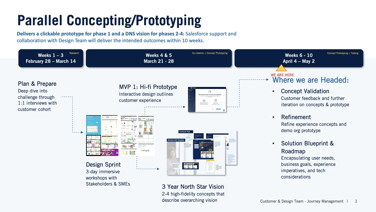
Working with a small cross-functional team (one product owner, a UX director who mentored me, and two junior designers), I led a 10-week engagement that balanced deep discovery with rapid prototyping. I led it the way I prefer to work: set up the problem clearly, then make room for everyone's ideas, the two junior designers and our subject matter experts included, rather than dictating answers from seniority. We ran two tracks at once: an MVP First Notice of Loss portal and a longer-range North Star vision.
Weeks 1-3
Research & Discovery
Deep-dive 1:1 interviews with beneficiaries who had recently navigated the claims process. We needed to understand their emotional state, pain points, and what "good" would actually look like at the worst moment of their lives.
Weeks 4-5
Design Sprint & MVP Prototyping
Three-day co-creation workshops with stakeholders and subject matter experts. We came out of them with our first high-fidelity prototype: a streamlined FNOL portal that could capture claim information and deliver a near-real-time claim package to the beneficiary.
Weeks 6-10
North Star Vision + Usability Testing
Usability testing with real users, run in rounds, while we built out the three-year North Star: two to four high-fidelity concepts showing the end-to-end change Prudential could make.
What We Learned
Beneficiaries told us exactly what they needed
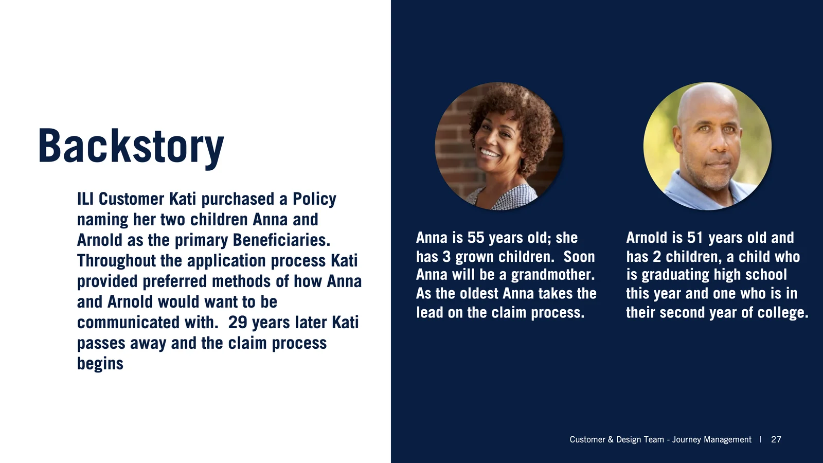
We built personas from those interviews. Anna, 55, took the lead on her mother's claim; her brother Arnold, 51, helped from the sidelines. Their mother Kati had bought the policy 29 years earlier. We mapped their path from the first shock of grief through the grind of paperwork and phone calls, and designed against that.
Design Principles
Six ideas we kept coming back to
Treat each person as a person
We shaped the intake around the actual claim in front of someone, not a generic case file.
Let people pick the channel
Beneficiaries decide when to engage, and whether that's online, by phone, or by mail.
Keep it simple, with help nearby
Clean screens that don't pile on, with help placed where people usually get stuck.
Be honest about timelines
We told people what the claim needed and roughly how long each part would take, so nothing landed as a shock.
Move quickly without rushing grief
We aimed for something close to a single-touch claim, but never at the cost of pushing a grieving person along.
Earn enough trust to last
Support a family well through a hard stretch, and some of them stay with Prudential afterward.
The journey we designed
From condolences to closing the loop
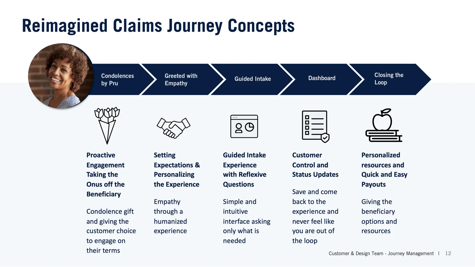
We designed a five-stage journey that begins before the beneficiary even knows to contact Prudential, and ends with them as a potential lifelong customer.
Condolences by Pru
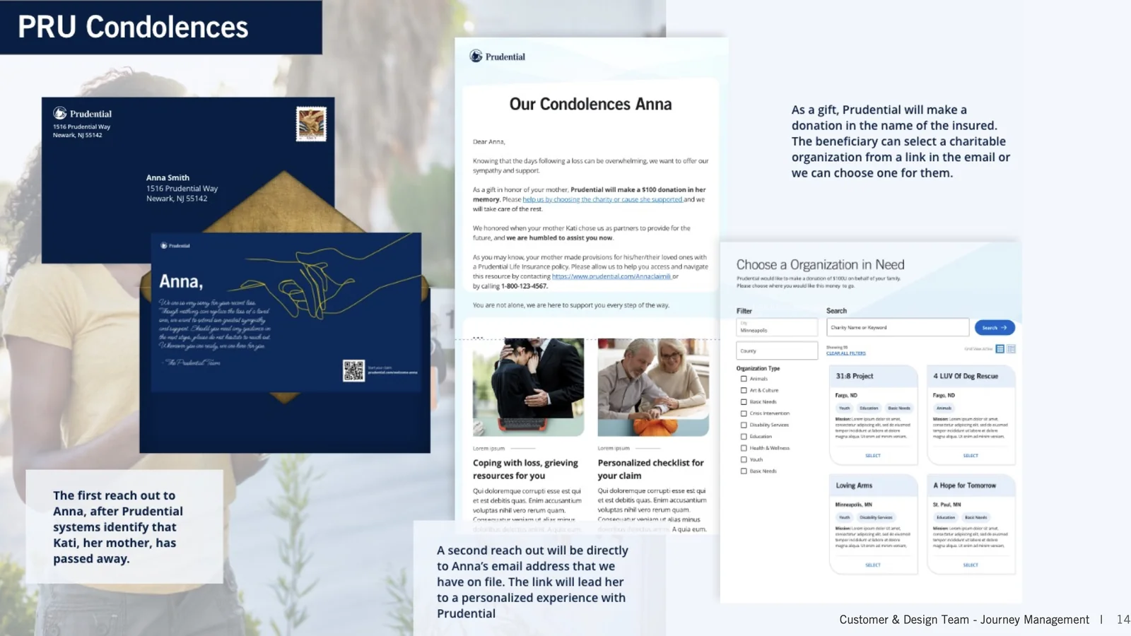
A condolence gift and a personal card arrive first
Greeted with Empathy
A welcome that sets expectations in plain language
Guided Intake
A simple form that asks only what this claim needs
Customer Hub
A live status they can check any time
Closing the Loop
Quick payout options and resources matched to them
The three-year vision
Awareness, then assessment, then engagement
The North Star broke this into three phases, each with specific touchpoints for how Prudential would spot a beneficiary, reach them, and help them through the rest.
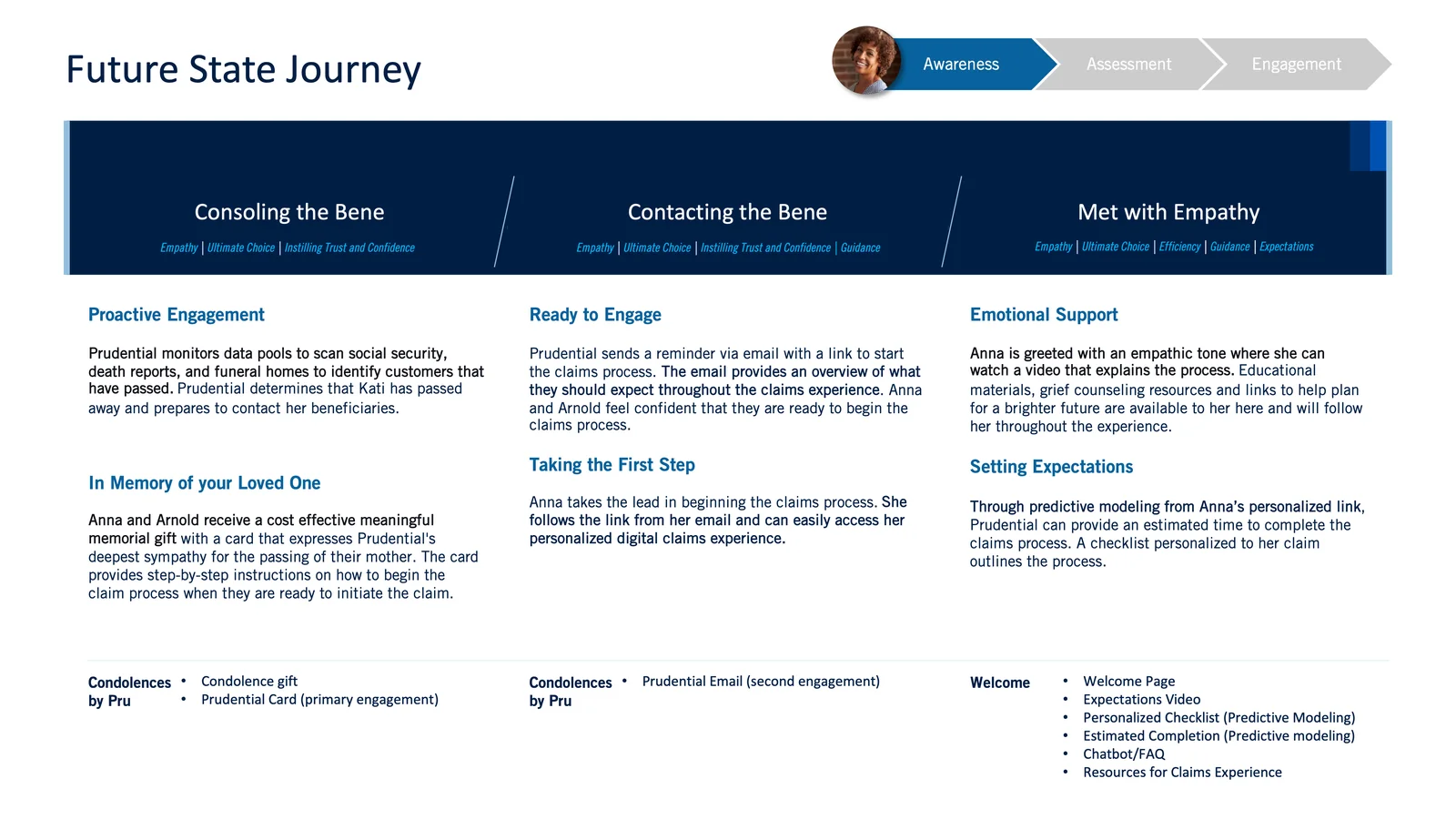
Awareness
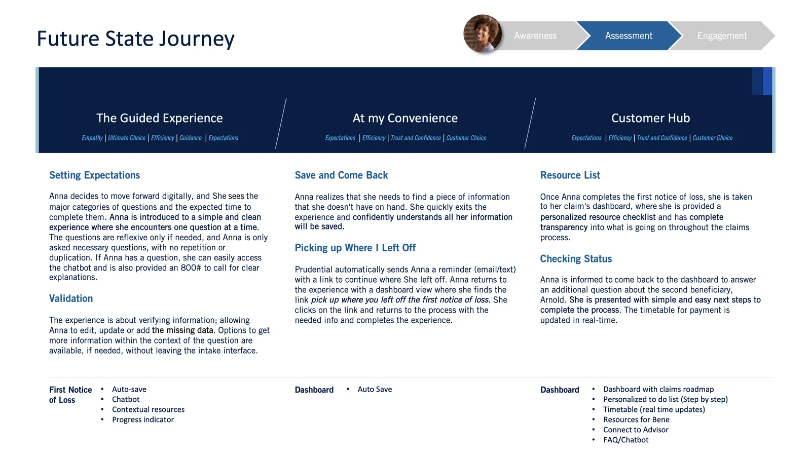
Assessment
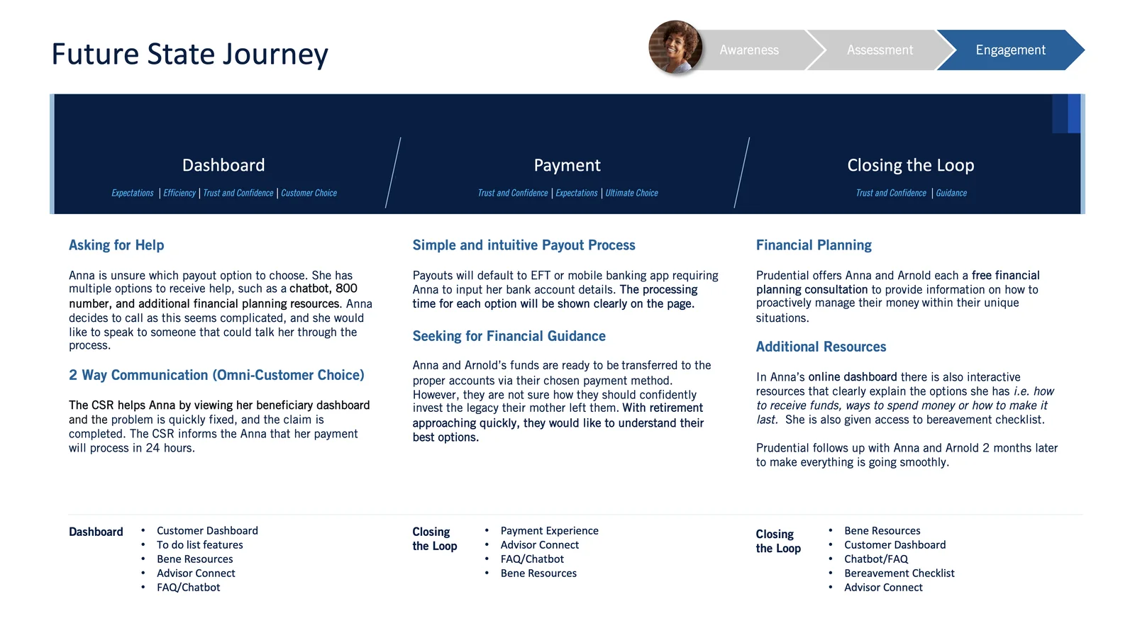
Engagement
The Solution
How the new experience works
Reaching out first
Prudential monitors data sources to identify when policyholders pass away. Instead of waiting, we designed a system to reach out first with a condolence gift and a personalized card. It expresses sympathy and includes clear, step-by-step instructions for starting the claim whenever the beneficiary feels ready.
A follow-up email lays out what to expect and links straight to their claim, so nobody has to dig through a website or sit in a phone tree.
A welcome built for the moment
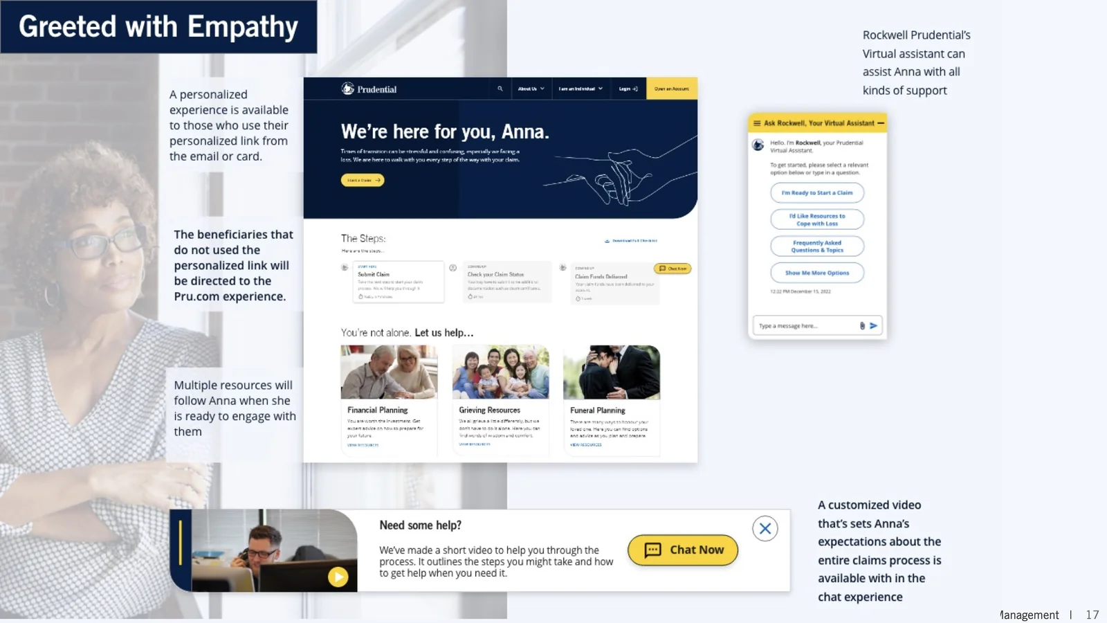
Anyone who follows their personal link is greeted by name, in a warm tone. They can watch a short video about the process, reach grief counseling resources, and see a checklist built for their specific claim type.
Rockwell, Prudential's virtual assistant, stays on hand to answer questions, connect someone with a live agent, or point them to help for coping with loss, any time and on any device.
A hub that shows the whole picture
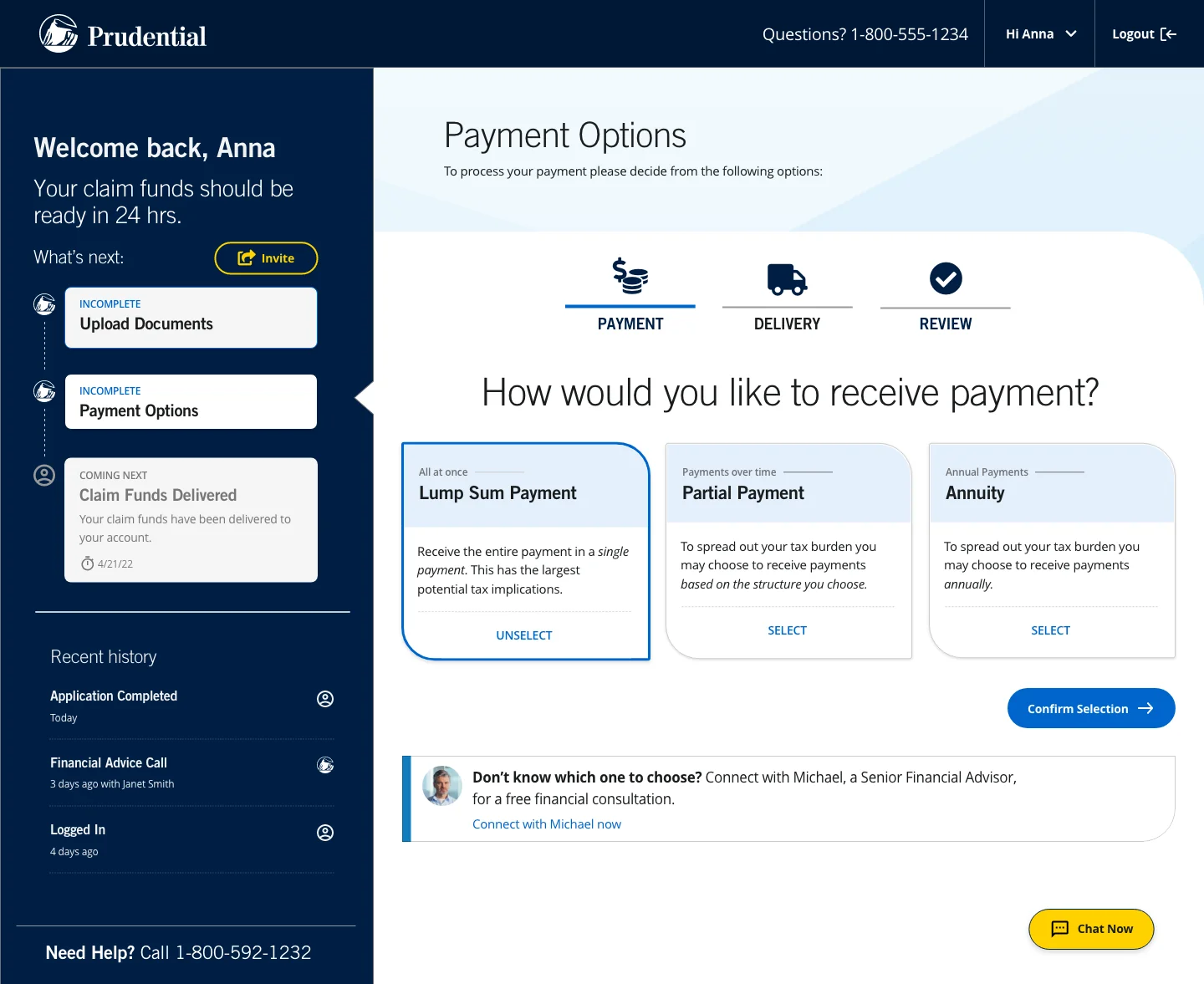
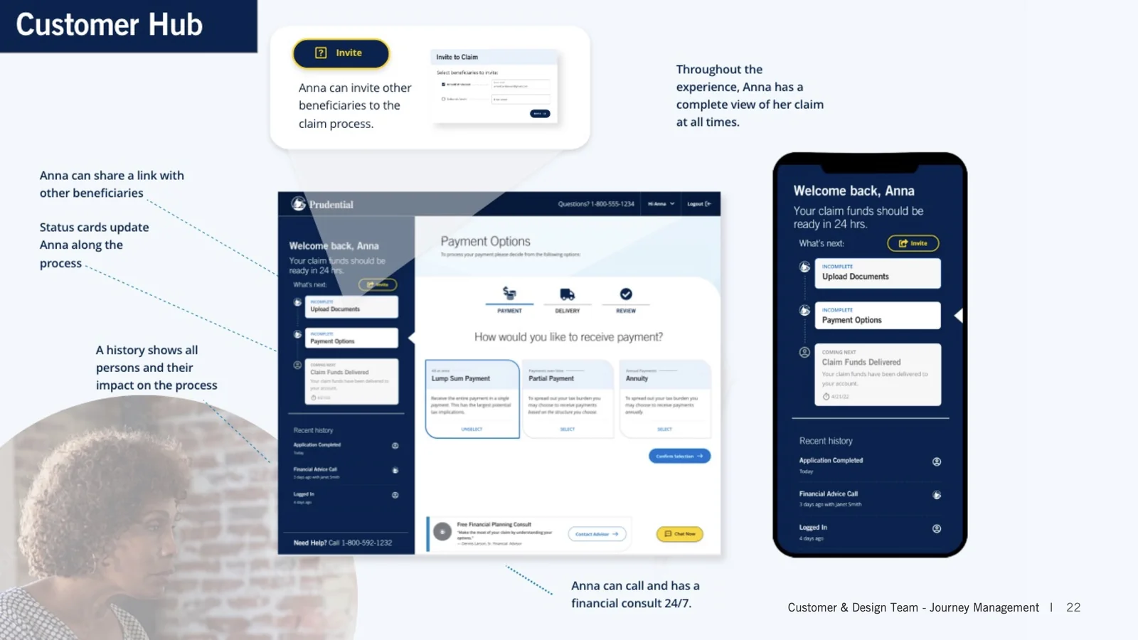
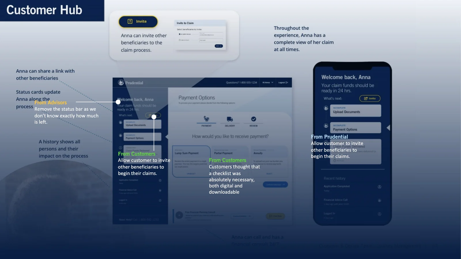
The dashboard puts beneficiaries in complete control. They can see exactly where they are in the process, what's been completed, and what's next. Interactive status cards let them complete one step at a time, with the flexibility to pause and return whenever they're ready.
Anna can invite other beneficiaries into the claim, share documents, track payment status, and view a complete history of every action taken on her case, all with 24/7 access to financial planning support.
Closing the loop, then staying in touch
When funds are delivered, the experience doesn't end. Beneficiaries receive confirmation with a heartfelt message and ongoing access to resources that continue supporting them: financial planning guidance, grief counseling, and funeral planning assistance.
The aim of that last step is plain: turn one hard interaction into a reason to stay, so the beneficiary becomes a Prudential customer afterward.
Target Outcomes
The targets we set
We presented the work to Prudential's executive leadership with targets attached. It set up a near-term MVP and a three-year plan for the whole ILI claims group.
Digital Utilization
Projected increase in digital channel adoption
Paper Reduction
Target reduction from baseline mailed forms
TAT Improvement
End-to-end processing time targeted for reduction
Ease of Doing Business
New measurement framework established for ILI claims
Reflection
What I took away from it
Designing for emotional contexts
This project reinforced that usability is only half of good UX. The other half is the emotional state of the people using it. Every microcopy decision and interaction pattern had to acknowledge that our users were grieving, and we couldn't trade empathy for efficiency.
The power of proactive design
The biggest shift was moving from reactive to proactive. Instead of designing a better form, we asked a different question: what if we reached out first? That reframe opened up the whole project, and became the foundation for the MVP, the North Star, and the executive vision.
"It should feel like a capable, kind person sitting next to you, not a form to fill out at the worst possible time."A principle we kept